Transdisciplinary Research ● UX Research ● Urban Design
A more nuanced US census could enable greater citizen engagement.
This project began with an assessment of current ethnic and racial categories commonly used in American data collection, statistic design, and mapping. The assessment led to a critical analysis summarized in the three points detailed below: (1) incommensurableness, (2) exclusivity, and (3) criminal history.
As it currently stands, the US census features five ethnic/racial categories.
Respectively, they correspond to the following types:
These categories have no common standards of measurement — they are incommensurable, like apple and oranges.
The current categories do not take in consideration ethnic, racial, and cultural diversity. They make it complicated to indicate any type of ethnic mix and other nuances.
The “fives races of humankind” were laid out in 1790, 75 years before the Thirteenth Amendment abolished enslavement and involuntary servitude. The categories were tools of racial crimes that still remain unrepaired today.
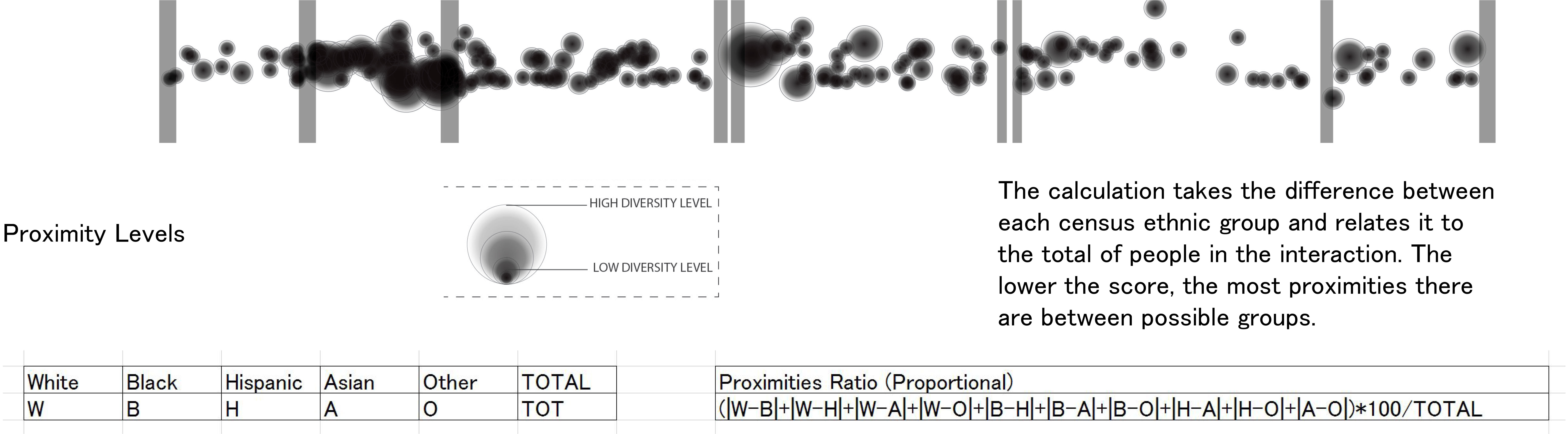
We became interested in mapping proximities between groups instead of racial categories.
The three sets of maps below display current standard methods of mapping ethnic and racial difference in the US. We studies these maps as a starting point to propose a new methodology.
We decided to work with the first of the three maps above which features a point of color for each individual fitting in a single category. The points aggregate to show areas that have categorical tendencies. These points can be used to map intersection between categories, or in other words, proximities among ethnic and racial difference. The animated image below explains the mapping process for proximities.
This methodology was used to make an urban ethnography of a neighborhood currently undergoing a racial transition — Harlem.
We situated our urban ethnography of Harlem with the proximity mapping technique at the scale of the nation, and zoomed into Manhattan and Harlem. View below.
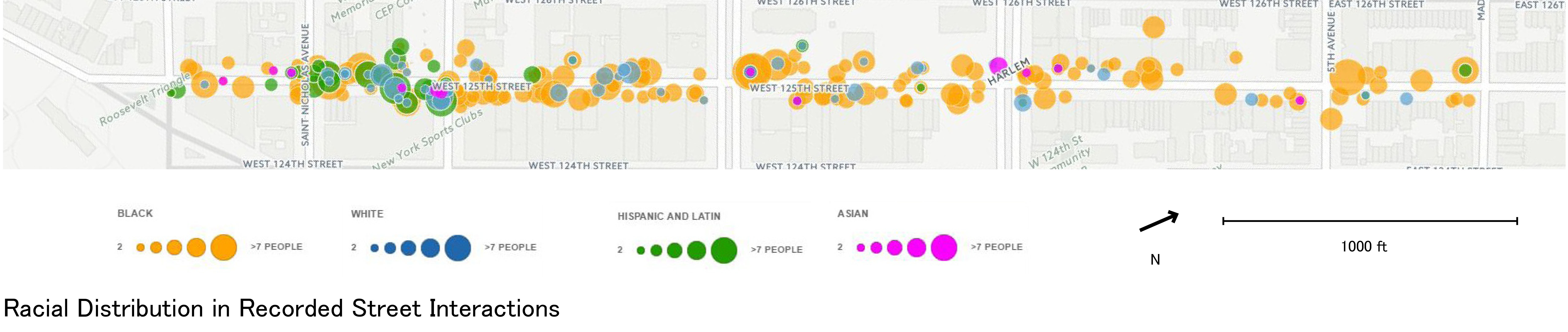
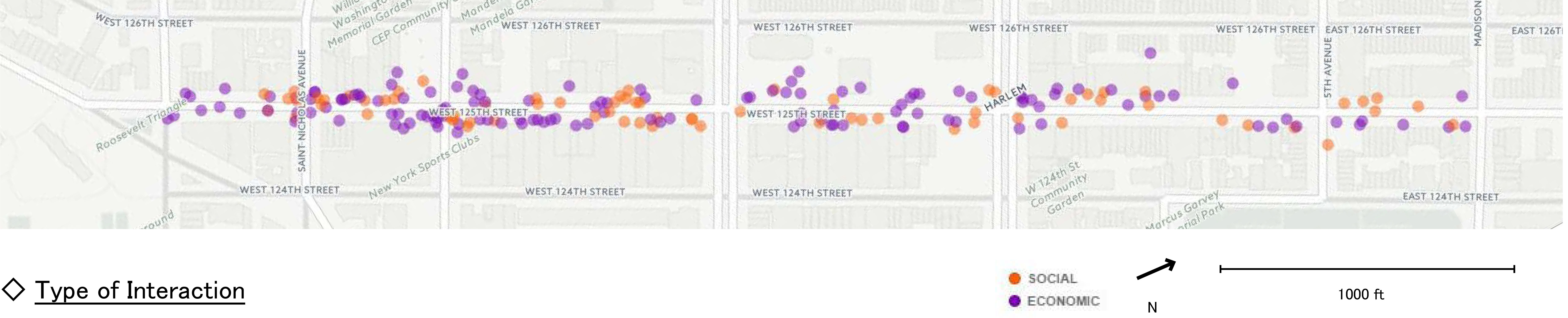
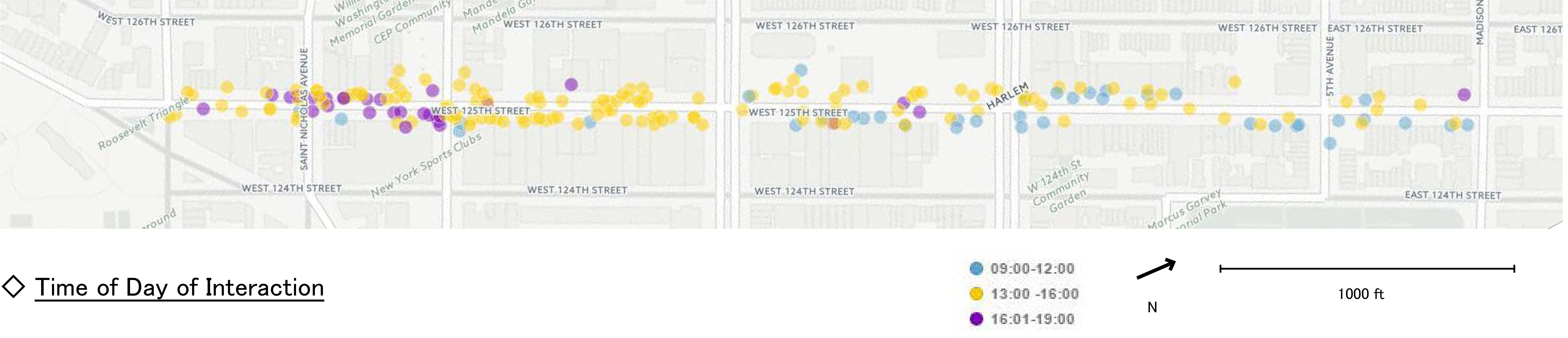
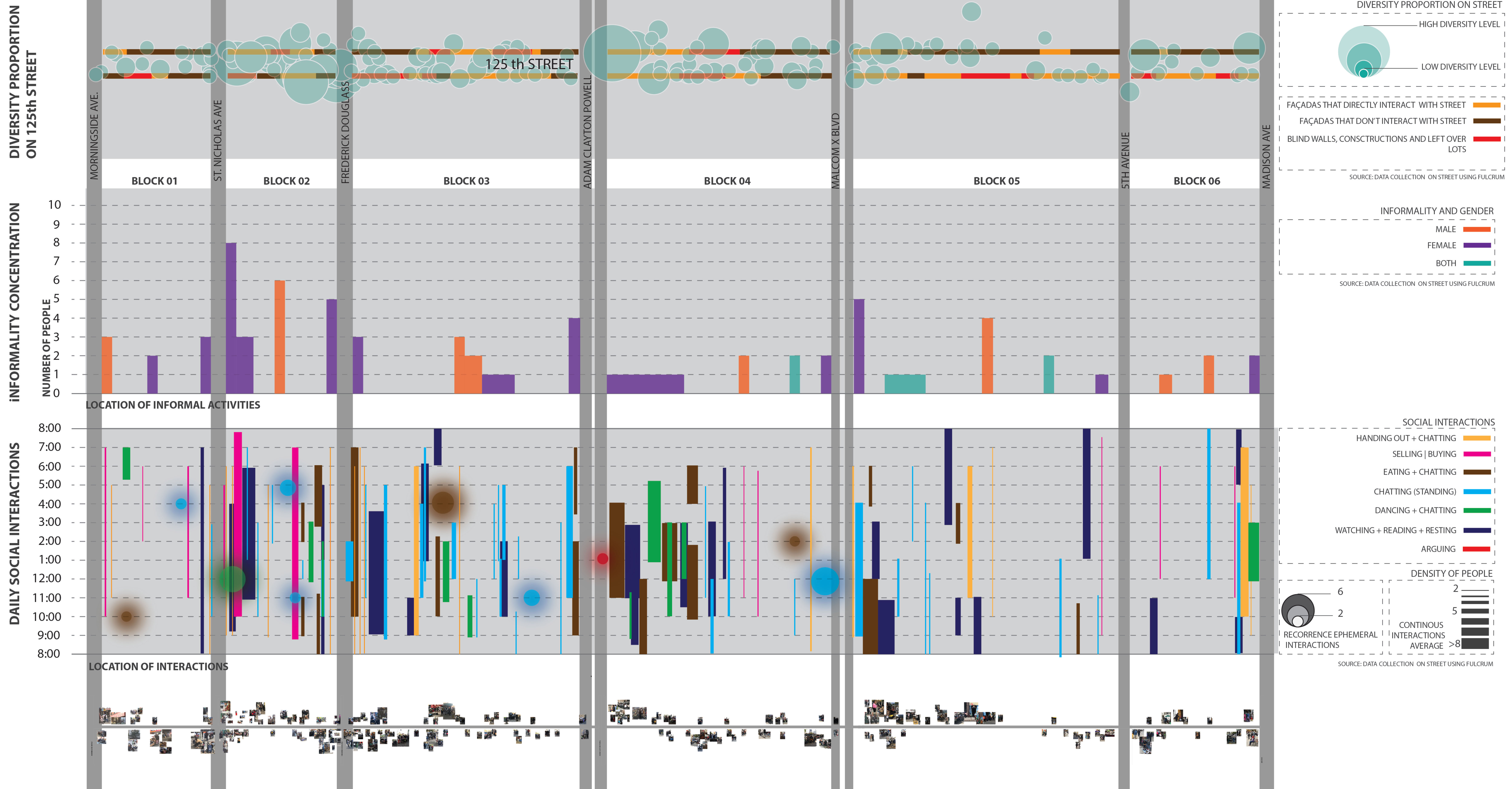
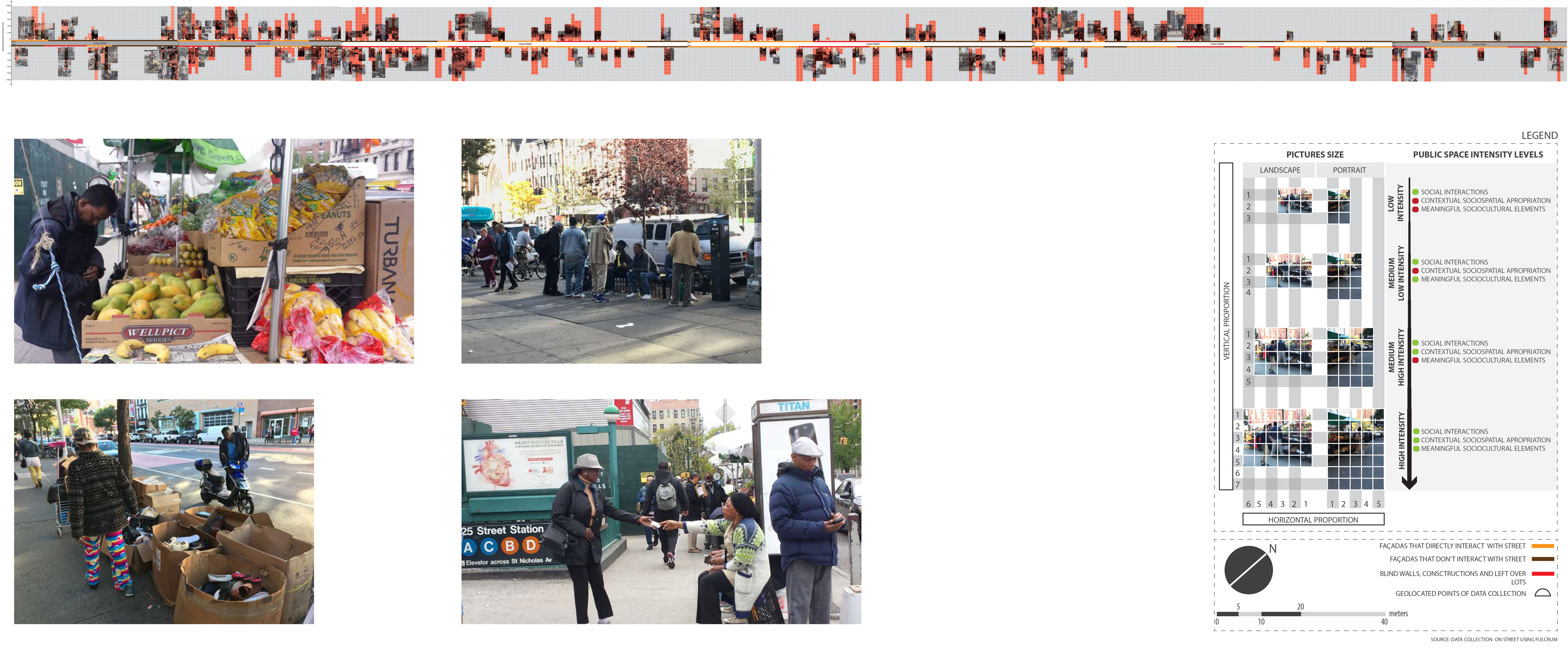
We became interested in comparing the census dataset with people on the street. We decided to focus our study on 125th street as it has most pedestrian traffic. We also decided to collect data about people's interactions.
We worked with an iPhone and Android app called Fulcrum to record information about the interaction of people we saw on the street. The app allows to enter information based on a query system and attached to a GPS location. The screen shots below detail the query we built.
The data collected on Fulcrum was exported in a spreadsheet. The screenshot below gives an overview.
The spreadsheet was visualized through OpenStreetMap as seen below. The racial categories were used to make a classic colored map which then enables to map proximity (view second map below).
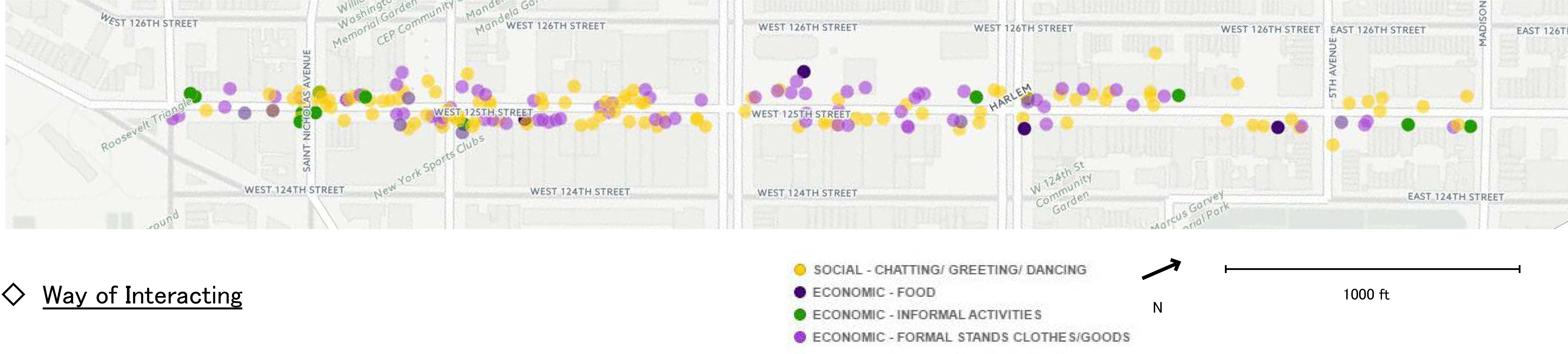
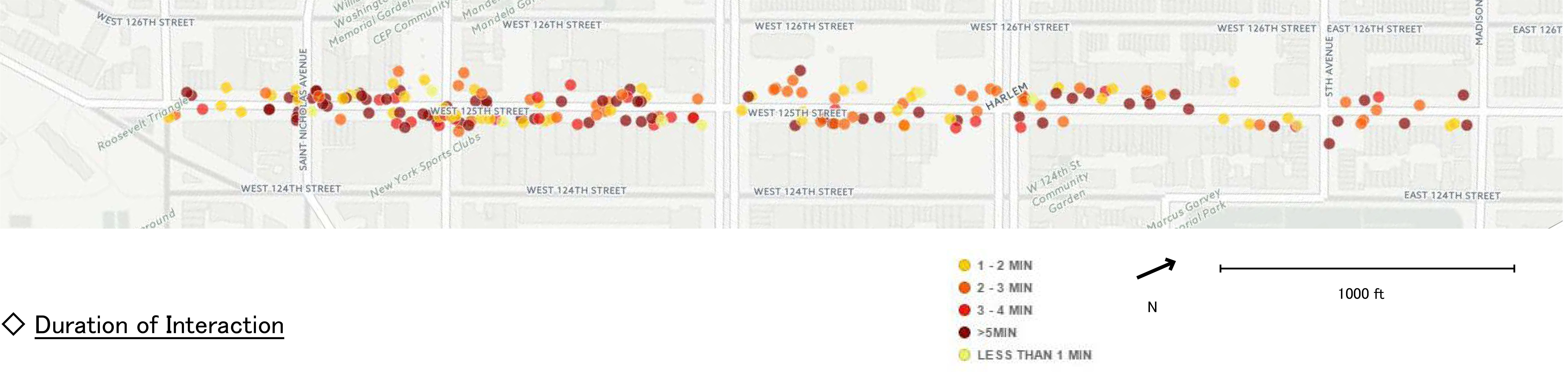
The following maps visually display data collected about people's behavior in various parts of the street: (1) Way of Interacting, (2) Duration of Interaction, (3) Type of Interaction, and (4) Time of Day of Interaction

'Le chêne,' pronounced [leuh-sheh-n' means oak tree in French, my native language.